Are you reading this article? Of course you are! That’s because there was something that called to you to take action; you clicked the link to read this full post. Did you get here from an email? Did you find something on our homepage that directed you here? If you did, that’s the Call to Action (CTA).
All marketers need their website visitors to take an action in order for the visitor to become a lead or a customer. Your homepage is your gateway for visitors to convert to leads. Your CTA is very important and if you are considering a redesign of your website then you’ll want your CTA to be high on the list. (Not necessarily high on the page.) Your CTA is more than just a button, it is also the content (and sometimes imagery) surrounding it. Does your CTA follow the below 5 pointers?
Voice of the Customer
VOC is one of those fun Marketing terms consultants like to use. What it means is that you listen to your customers, understand their primary pain points and you know how to speak to them in their own language. When redesigning your website, you’ll want your site visitors to understand quickly what you can do to alleviate their pain. If that is clear it is more likely that they will take the next step–your CTA. The CTA should be embedded into this so that the connection is obvious. Also make sure that every step of the way, you are speaking to your visitors in their own language and not using your own internal or overly-techie jargon. In a nutshell: know your audience.
Hand in hand with VOC is the tone you use to express urgency, professionalism and approachability. Marketers have mere moments to grab your attention and get you to act on an offer. Your CTA needs to convey that acting now is in the visitor’s best interest. After all, you are the expert on your business and you are here to solve your visitor’s problems.
Directive Imagery
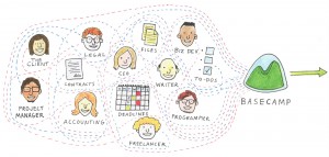
Graphics enhance the experience for website visitors. Those images can relay a feeling, an understanding or a connection instantaneously. Charts, photos, sketches or masterpieces all can sum up your company quicker than any boilerplate could. If this graphic is so powerful then why not associate it to your CTA? An excellent example is the Basecamp home page. The image is simple and leads you to the CTA button.

An image is not mandatory but it stimulates the visitor to follow your CTA. Arrows pointing to the next step, a photo of a person gesturing to your offer, an image of an athlete running towards the button to click are all examples of employing an image to strengthen the CTA. A big mistake to immediately correct is removing an image that is looking away, moving away or pointing away from your CTA.
Action Words
Read this paragraph. Take notes. Redesign your CTA.
Enough said.
In all seriousness, you need to tell your visitor what to do. Are you telling them to “Click” a link or “Submit” a form? Or is your CTA unclear: “Here” or “Next”. The words you use will make or break this relationship, so although “Click here” may be the obvious action for the visitor to take you may want to think of something more creative to fit your product or solution. Maybe a “Give it a Go” or a “Get Started Now” are more appropriate.
Location
Where on your homepage should you place the CTA? It should be placed where it will be noticed. Sounds simple right? Research on text heavy pages show that readers tend to scan the page in a letter Z or letter F pattern. Spartan web pages are treated differently. A general rule of thumb: if the CTA is on the top half of your screen (above the fold) it will be easier found then if the visitor needs to scroll. However if you are telling a story there may be good reason to place the CTA lower. A complete audit of your homepage along with a clear understanding of your solutions and customers’ needs will provide insight as to where your CTA is best placed.
A/B Testing
In a sea of free trials and no obligation offers, we need to find a CTA that won’t get lost or glossed over! A redesign of your CTA (with a little creativity) can provide material for a successful A/B test. Maybe the A is your original design and in the B you added a new image to your CTA. Deploy both and wait for the results! Sites such as Optimizely or Google’s Content Experiments can provide you with page view stats, and click through rates. After enough visitors have seen your pages, you’ll see which version resulted in more revenue. Then, test the winning version against another new version. Rinse, repeat and run all the way to bank singing the praises of your redesign.
Conclusion
Know what your customers want to do at your website and make it incredibly simple for them to do it. Be sure to follow these 5 tips:
- Use the voice of the customer so that they don’t have to translate your words into their own language,
- Add in some directive imagery to persuade the visitor to look in the right place,
- Tell your site visitors what to do with action words,
- Place your call to action in a compelling location,
- Test your new design against the old design to determine if your changes result in better metrics.
Your homepage is your online storefront and the CTA is your front door. Make your door swing open to those who are window shopping and have them step in and convert to a customer.
Would you like to increase your lead generation rate and increase your revenues? Caffeine Consulting is ready to help.
